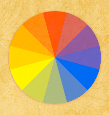
There are no images above, nothing but css (half of it vendor propriety, sadly), and this was entirely created with primary colors: Red Yellow and Blue. Why? Because I wanted to see how well you could create other colors using additive color mixing methods like you would with paint through overlayed rgba semi-transparent colors. A standard color wheel with secondary and tertiary colors was the obvious test. This works in Firefox, webkit browsers and even, yes, Internet Explorer. Well, the curved edge that makes it a circle doesn’t work in IE. But the semi-transparent color overlays to simulate additive color mixing that I was wondering about? Works like a charm!
So we’re all on the same page regardless of browser, this is how it looks to people using a mozilla or webkit browser:

Color Wheel in mozilla and webkit
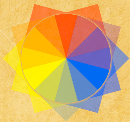
And this is how it looks in Internet Explorer:

Color Wheel in Explorer
Firefox, Safari and Chrome
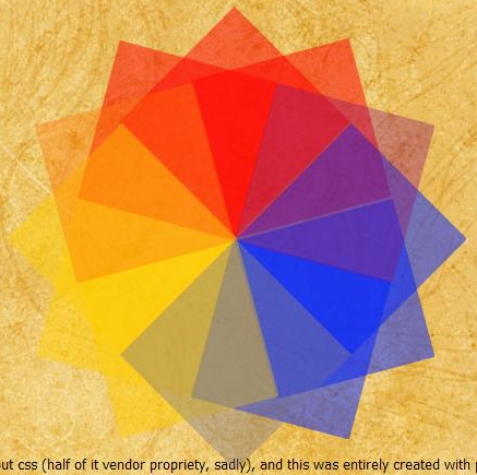
This is a fairly simple — if somewhat time consuming — illusion to create in Firefox and Webkit browsers. I decided to use 90° angles for each layer of color, with each subsequent layer 30° rotated further around the center point. Each of the primary colors is displayed at 50% opacity, except at the edges where there is an identical overlap with the next color’s endpoint. I made these endpoints 20% opacity to simulate the color getting lighter where one bleeds into the next.
Let’s take that one piece at a time.
First, I need a space to lay out the layers. I create a div and give it the creatively-named class of cw_out (color wheel outside). I choose a height and width of 400px because that’s the width I use for photos so they will fit in the main column on my front page. I’m going to nest the circle into the middle of this circle with a 50px cushion (you can see why if you glance above at what it looks like in IE).
Next, I needed a rounded, 90° quadrant of a circle. My circle is 300px by 300px so a quadrant is 150px by 150px. Once I’ve made a square layer, I need to change one corner from squared off to an arc. This is added by border-radius, which isn’t really supported yet on its own, so you have to use the vendor-proprietary versions, -moz-border-radius and -webkit-border-radius. I only want one corner (the top left for no reason other than it was the first one I picked) curved though. In Firefox, they’ve implemented the familiar shorthand you’re used to, where you can do each corner independently, but Safari hasn’t. You have to use -webkit-border-top-left-radius — note that in firefox there’s no hyphen between top and left, and the words are flipped, if you aren’t using the shorthand: -moz-border-radius-topleft. But I’m a fan of shorthand, so my code for turning a square into a quadrant looks like this: -moz-border-radius:150px 0 0 0;-webkit-border-top-left-radius:150px;, which looks like this:
Then I have to tilt it so it fits in my circle. I tend to put red at the top, mainly out of habit, so I want my main red quadrant at the very top of the circle. In comes transform. The kind of transform we want to use is rotation, and luckily other than the vendor prefixes, the syntax is the same. To sit my quadrant at the top of the circle with its point in the center, I needed to transform it 45° clockwise, which looks like this: -moz-transform: rotate(45deg);-webkit-transform: rotate(45deg);, like so:
Something to remember when you use tranform on an object is that its top and left don’t change, but they are relative now to the entire shape, which will not have the same apparent height and width as the non-rotated shape… however, when the browser renders it, it only allots the space for the non-rotated element. So in appearance, my square is now roughly 215px tall and wide (you can’t see the top part because of the border radius but it’s there), but the browser still renders the elements around it as though it were 150px tall and wide. That means the roughly 65px overhang at the bottom overlaps whatever’s next in the flow. (I fixed that in my example by moving the box up so it didn’t overlap this paragraph).
Next: positioning it to be a circle instead of random jumbled layers. I’m sure there’s some programatic, trigonometric function for figuring out how far off the top and left needed to be, but I decided it was faster to place a 1px wide and tall div in the very center of the box and guesstimate til I got the points on the 1px div (I’m very good at estimating distances on screen in pixels so this is a fast process for me). It’s easiest to do this with one piece at a time though, so when I finished positioning this first piece, I put display:none; at the end of the css declaration to hide it and performed the same steps on the next piece, until I’d done all fifteen of them.
To give you a good feel for what I mean by “overlapping layers”, here’s a screenshot with the border-radius removed:

Color Wheel in Mozilla and Webkit with border-radius removed
As you can see, the endpoints of each color dovetail over each other.
I put a circle (ie, a square with a border-radius equal to half it’s height/width) around the outside mainly to give it a solid edge and reduce visual interference from my textured background. I applied just a touch of a box-shadow to give it a slightly raised, three-dimensional feeling.
Internet Explorer
Doing this in IE turns out to be a whooole lot more complex… but still almost entirely doable and much of it has been available since IE5.5, believe it or not! Why spend the freakish amount of time to make it work in IE? Because frankly, I’m sick of seeing “Hey, isn’t this new css3 attribute nifty!” without finding some suitable way to accomplish something similar or at least meaningfully and gracefully degraded for IE. So long as most of the market is still on some version of IE, your nifty experiments are just time wasters if you’re not also finding a solution for IE (or designing exclusively for mobile). I dislike IE just as much as the rest of my design brethren, but I also know that without my users, there’s no reason for the design to exist in the first place, something I think half the web world has forgotten.
Ok, I’ll make an exception for The Pure CSS3 Fail Whale. That’s not a meaningless time waster. That’s just cool, and I’m kind of impressed by how well it rendered even in IE.
But back to color wheels. IE has it’s own custom non-css called “filters” that you can call from within a css declaration. These are occasionally processor intensive and it’s better to avoid them where possible. They are most definitely non-standard. But they’re there, and they work, provided you’re willing to do a little jury-rigging of your code. There’s a wide range of filters available (I would not call it a full range and many of them are kind of useless, but there’s quite a few out there).
Because I don’t want to only use right angles for rotation, I ended up going with the Matrix filter. I’ll avoid the obvious movie-related jokes because after you read the specs on that one, you’re already going to be wishing you’d picked the blue pill without additional pun damage from me. Essentially, there are six variables relating to cosines, sines, and other trigonometric functions. I’m not sure why they implemented it this way — I’m guessing it’s the underlying programming related to how all programs render rotation. Regardless, it’s not something I feel like having to figure out for fifteen divs with six variables each. They’ve included a javascript function for determining the variables for each rotation and if you’re only doing rotation, I suggest just lifting that. Or you can go to css3please.com and type in your angle of rotation and copy the M values for the transform filters from that. That’s what I did. There’s a caveat though if you do that. There’s an issue in the ie7 and earlier version of the transform filter that is not accounted for by the css you will get from css3please.com. Here’s what those filters look like coming from css3please.com:
filter:  progid:DXImageTransform.Microsoft.Matrix(sizingMethod='auto expand',
    M11=0.7071067811865476, M12=-0.7071067811865475,
    M21=0.7071067811865475, M22=0.7071067811865476);
-ms-filter: "progid:DXImageTransform.Microsoft.Matrix(SizingMethod='auto expand',
    M11=0.7071067811865476, M12=-0.7071067811865475,
    M21=0.7071067811865475, M22=0.7071067811865476)";
That’s the IE 5.5+ equivalent of css3’s transform: rotate(45deg);. I know, not too pretty. Let me explain the pieces and then I’ll explain how you have to change it to make it work in IE7.
First, you see filter and -ms-filter. I suppose in the interests of moving toward the correct behavior of all vendor proprietary css being prefixed with a vendor code, they’ve changed some or all of the filters to use -ms-. That’s good. The bad is, they removed support for just filter (hope you weren’t using them too extensively when IE8 came out…). So now to hit all versions of IE, you have to declare your filter twice. For some filters (like the opacity one below) you have to declare the vendor prefixed one first or it will fail in IE7 and below. Matrix is not one of those filters. Leaving it in this order is fine. Note also the quote marks on the prefixed version.
Sizing method refers to the bounding box of the element. There are several combinations available for the sizing method but mainly it boils down to what renders. You can clip/crop the element, or you can expand the element so the whole thing remains visible (which is what I’m doing here).
You can see here M11, M12, M21, and M22. The two not shown here are Dx and Dy, which don’t have to be declared because I haven’t included an “augmenting vector”. As for the Ms? I’m not even going to pretend to have any idea how those values translate into “rotate 45°”. They can be used for skewing, resizing or rotation.
One other note about using the transform filters: If you want to use them on an absolutely positioned element, its parent also needs to be absolutely positioned. Now, my parent container is relatively positioned so it works with the layout of my blog, so I put another container inside it and absolutely positioned that. Additionally, any element you want to apply a filter to must “have layout“. This is an IE-only concept and my usual solution is to use display:inline-block; followed in a new declaration by whatever I actually want it to display as.
Now for the problem: In IE7 (and perhaps earlier, I don’t have access to check), the sizing method needs to be at the end of the declaration for “filter”. Otherwise it simply fails to render and I had issues with all css that comes after the filter being ignored. I’m going to assume this is likely some kind of parser error and it might even be an error that only happens in IE8’s version of IE7. Whether you’re writing your own filter up or using the one from css3please, you need to move the sizing method to the end. So for a 45° rotation, your declarations will look like this:
filter: progid:DXImageTransform.Microsoft.Matrix(M11=0.7071067811865476,
    M12=-0.7071067811865475, M21=0.7071067811865475,
    M22=0.7071067811865476,sizingMethod='auto expand');
-ms-filter: "progid:DXImageTransform.Microsoft.Matrix(SizingMethod='auto expand',
    M11=0.7071067811865476, M12=-0.7071067811865475,
    M21=0.7071067811865475, M22=0.7071067811865476)";
So far, so good. Next, transparencies. Sadly, IE does not recognize rgba color yet. But it does have filters for opacity.
If you’re not trying to do anything that will involve transform filters (like rotating the squares), then you can easily do the overlapping transparencies with -ms-filter:"progid:DXImageTransform.Microsoft.Alpha(Opacity=20)";filter:alpha(opacity=20);. Sadly, as soon as you apply a transform to it, the element reverts to full opacity because the alpha channel is stripped from the element as part of the transform. There’s a workaround for this that I haven’t seen anyone else using.
You can’t put the alpha transparency back on the element. One obvious possibility is to nest a new element inside the rotated one. This falls down as soon as you try to position it though because the nested element loses its parent’s rotation. Positions relative and absolute will position the box in reference to the origination point of the parent box (which, as with Mozilla and Webkit above, is where the box WOULD be if not rotated, not where it looks like it is on screen). So you end up with a semi-transparent, non-rotated element.
The way to get around this is to tell the browser to make it part of the standard flow, using position:static;. Once made static, you can make it a block element and size it. You can’t position it — if it’s the first thing in your rotated element it will sit at top:0;left:0; and you can’t change that. So you make both containers the same size, position the rotated container and then use the child container for the transparency. Turns out that though the transform strips off the alpha channel, you can still use a fully transparent background on the rotated container. Here’s an example with a border on the parent container so you can see it.
Once I figured that out, it was a simple matter of following the same steps as I had for Mozilla and Webkit for positioning — and of course all the positioning was different for IE than other browsers, so I ended up just giving in and using conditional comments to write some IE-only CSS (why not, I’m already using filters…).
Conclusions
I’m less than enthused by the green. It’s decent in Safari, a little better in Firefox, but just not green in IE. It’s more of a muddy grey. The orange in IE turned out very well though, so I’m not willing to outright say that additive color as a whole is a failure in IE. There do seem to be some problems with apparent opacity not matching actual opacity, which seems to be based on how dark the original color is. If I’d gone with a lighter blue, something with the same lightness as the yellow, I think I would have ended up with a greener green.
Update, April 2012 – Apparently IE9 doesn’t like my css. I assume it’s the filters, as those seem to be the source of most problems I find with IE9. When I get the chance I’ll take a look at updating this to work in ie9 as well.
You can stop here or I’ve formatted the code in a more reader-friendly way on the next page if you’d like to see it in full. Go To Page 2
Pages: 1 2
Leave a Reply