Quick progress update on where this piece is at:
Crystal
Character Module Design Process: Interface Requirements
Referring back to the first post in the series, you’ll see near the bottom a list of screens, both new and existing.
The next step in developing the Character Module is to take the userflows and the list of affected screens and distill it to a table of just what exactly needs to be on each of those screens. This table is known as the Interface Requirements for the project.
I find a spreadsheet to be the easiest format to maintain. Each screen will get its own section (or tab, if I was in excel). I tend to use a streamlined version for my own projects, with only five headings: Item, Type, Text, Role, and Comments.
It’s important not to skip this step. It’s tempting to jump straight into visual design, but separating out the types of elements needed on a screen first can improve the usability of your design by letting you group controls right from the beginning where appropriate and ensuring that you don’t get 3/4 through a design and realize you’ve missed an entire userflow’s worth of elements that you then have to bodge into the rest of the design.
In this case the requirements list for screen one was fairly lengthy, so I am only showing screens 2-5 here:

Let’s use just Screen 2 for discussion. Screen 2 is a list of all the characters in the system. The page will have two primary sections: the filters at the top, and the list of characters. You can see that I’ve then broken each of these sections down based on what type of element was in the section. The filters are a series of controls for use in controlling which records are shown, and each control has an entry for the text relating to it. All of the elements on this page are viewable by the public but some controls or information may display to only registered users or only to admins. The records list consists of a row of controls in the headings, the list itself, and then further controls at the bottom for controlling which page you are on.
All of the other screens have been broken down in a similar fashion.
Now that I have this table of requirements, I can go on to the next step, which is to create wireframes for each screen.
Depths
Gift Certificates
 Sell Gift Certificates through Google Checkout
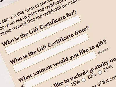
Original project, Summer 2012: Taylor Therapeutic offered gift certificates to customers in-person but wanted to offer them on his website as well.
The original challenge was to create an interface for his customers to use that would communicate with Google Checkout and then allow them to retrieve and print off their gift certificates as soon as the transaction was finished.
For a single item, it seemed excessive to build out an entire user registration system and shopping cart, particularly since users would then still be required to register their information in Google Checkout directly. On the order form I opted to collect only the information that was not already part of the Checkout registration to reduce user annoyance. This serves the double function of putting the onus for keeping any sensitive information secure on Google — if we don’t collect and store that information locally then there’s no avenue for the information to be compromised, and Google, as the credit card processor, is already obligated to elicit and safely store that information anyway.
Once the order is processed, the customer can retrieve their gift certificate in pdf form from the Taylor Therapeutic website using the order number. This ensures that only successful transactions produce a file, but allows customers to send the certificate on to whomever they’ve bought it for either as a link or a file via email, or to print it themselves.
Update October 2013: I just finished rewriting the gift certificate sales process using Stripe‘s API. I was quite happy at how much more control and versatility Stripe offered to developers, so a natural byproduct of the rewrite was a more streamlined user experience. Users no long have to leave the site to go to Google and then return — they can purchase their gift certificates without ever leaving Taylor Therapeutic’s site. It also permitted me to build a direct link to the completed gift certificate without requiring users to find and input their order number, because I had complete control of the email receipt being sent, and because I could immediately retrieve the transaction id from Stripe before the page finished processing.
Photoshop Challenge: Character Portraits in a Movie Style
My husband Tony is a budding new designer, and we’ve recently instituted “Photoshop Challenge Days” between us. It’s a great way to practice our skills and do something fun together at the same time.
Monday’s challenge was “Pick a movie poster and do portraits in that style.” We both play Star Wars: The Old Republic so we decided to use our characters (and those of our guildmates) as subjects of the challenge.
We both (independently) chose Mafia movies. What can I say? It’s appropriate to the characters. He picked The Godfather (you can see his challenge work here); I went with first Goodfellas and then, since that’s actually an ensemble poster rather than individual, Scarface:

Continue reading


