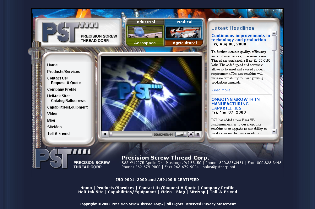
Precision Screw Thread Corp.
The initial landing page for the site was conceived as an abstracted display panel from one of the threading machines and evolved into what you see on the page now. We wanted to showcase the short movie but avoid the typical “trash splash” intro that trips up a lot of sites. This display panel instead brings together the site’s navigation and news from the company blog to make it easy for users to get where they want to go on the site (I was outvoted on making the movie start playing immediately. Sorry visitors, you’ll have to hit stop instead of start).
The internal pages carry through the theme and the navigation from the intro page. We wanted to add a little motion so I animated the starburst behind the logo in the upper left so that it glows and rotates on mouseover.


Leave a Reply