I always start logos with a solid black silhouette version. If the form of the overall logo is not distinct, no amount of gradients and colors will make it stand out. From there I make several color variations based on colors agreed upon with the client or that match what the client wants their logo to say.
I may also make full color variations for use on websites or large applications (such as a billboard) where those details will enhance rather than distract.
A primary principle I adhere to in logo design is to remove my own design hallmarks from the process as much as possible. I aim to capture the client’s brand first and foremost. Some designers repeat themselves or work within only a few styles trying to be recognized. I don’t need other people to look at a logo and immediately think “Oh, Crys designed that.”
In no particular order, here is a selection of logos I’ve designed using this process.

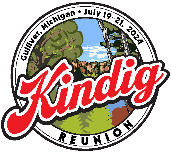
Kindig Reunion Logo
The logo draws from a few influences. First, I wanted it to be grounded in the rural location the event was taking place. The painting in the background depicts a pond in the upper peninsula of Michigan very close to the farm, and I painted it from a photo taken by the organizer. The round border and spacing evoke small town seals and logos in the Midwest. Large swooshy red letters run at an angle across the scene, suggesting sporting, tailgating, festivals or music events.
The organizers used this logo online in invitations and web pages. Additionally, I adapted it to work with some keepsakes for attendees and handled production through printing partners.

Tarot Skwirl
I started with the idea of making the squirrel’s tail the S and built it up from there.


Eric Dillie for ACOE Area 7
I created a bold, forthright logo for Eric Dillie’s campaign for Alameda County’s Board of Education, Area 7.

Jovan Construction
The controlling idea of the Jovan logo was the incorporation of the golden ration.

Crys Odenkirk Art
Yes, I’m including my own logo in this list. I use this logo, in different configurations, specifically with my Youtube art channel and Etsy shop.
TheVentureCo.org Logo and Theme

Blue “ice” logo for theventureco.org
Single Color Version
I created this logo for use by the roleplaying community forums for The Venture Co (US) server from World of Warcraft. The quirky shapes and the way the letters run together is a perfect reflection of the the community itself.
Leave a Reply