Two things that all transactional sites have: success messages and error messages. Ideally, these messages will be at the top of the page and be set off in some way through color or other visual cues. Using green and red respectively is the obvious choice, but this poses a problem: people who are color blind will not be able to tell the difference.
Icons are one solution to this problem. If you preface your system messages with distinctive icons, this can serve as a quick visual cue to experienced users as well as distinguishing between types of message for people who are color blind or who use screenreaders (the reader will read off the alt text of the icon, so you can use this to convey a message to screenreaders only).
Icons can be tricky. They have to be small enough not to get in the way but large enough to be recognizable. Making graphics at that size requires pixel perfection and any iconmaker’s path is littered with failed icons. My favorite, lost to the annals of server upgrades, was one particular trash can I was trying to make that when saved at the right side turned into… Cthulhu!
The demands of making your icons small but recognizable mean you have to go into them with a clear concept. I like to pull out my colored pens and brainstorm around the basic shapes that symbolize whatever you’re trying to make an icon for. Picking a symbol can be the most difficult part of the process. For an error, what do you use? The yellow “caution” triangle? An exclamation point? The red “prohibited” bar and circle?
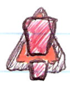
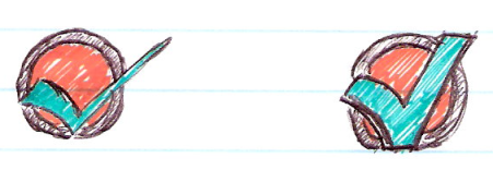
For my current project, I chose a combination of the exclamation point and the caution triangle. A green checkmark was my immediate first choice for the success message. Out come the pens. It’s important not to censor what you’re drawing, just to let the shapes suggest themselves to you the way they want to be drawn. I usually have about five or six different iterations before I sit back and pick a style and form.
My final, chosen drawings ended up like this:
From here, I usually move into Photoshop. Some people use Illustrator, but I find Photoshop a lot more intuitive. The key to making your icon recognizable is starting big and going bold. Any line that you want to be visible in the smaller icon has to be several pixels thick in the large version, or it will scale to less than a pixel and disappear. You can get an immediate preview of your work by reducing the magnification until the icon is close to its final size. After a bit of consideration for how to get the borders on the triangle and circle, these were my “full size” icons:
Note the thicker border on the symbols themselves. This will help them stand out from the background, especially after they’ve been shrunk to:


Leave a Reply