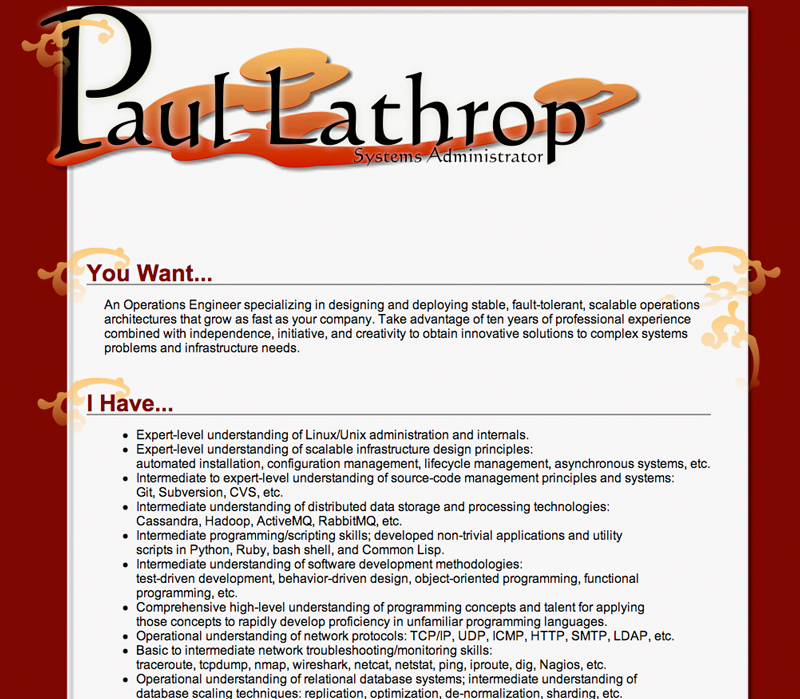
Online Resume Design for Paul Lathrop
Resume designs should have personality, but the design should never get in the way of telling the person’s story. For Paul, I knew that I needed something typographically simple that could get across the practical and efficient side of his work, but that was a little playful and conveyed just how vibrant he is as a person. This particular shade of red, as a background, I chose because it’s solid and very active, but not so blindingly red that it detracts from the most important part of the page: the text. For the font I used the most basic Arial/Helvetica/san-serif font stack, and stuck to a single font stack throughout the page (except the header graphic). This generates an attractive screen-viewed page that focuses on Paul’s work experience without being boring (because Paul is anything but boring), and leaves a clean, minimalist print version.

Leave a Reply