Create an identity for
a brand new animation studio
There was a sense early on that we wanted to go in a direction that was fun and a little over the top (ok, maybe a lot over the top) to match the personalities of the principal artists. A brainstorming session brought forward elements culled from comic books, traditional cel animation, old kung fu movies, sci-fi and, above all, laughter.
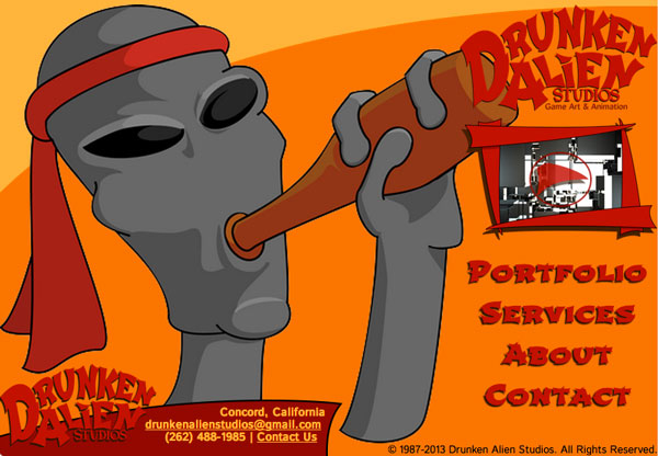
Long before settling on a name, we verbally sketched out a mascot that encapsulated the principles we wanted to portray. Mixing sci-fi and “drunken master” themed kung fu movies, we hit on a gi-wearing, beer-and-whiskey-drinking gray alien (shown to the left is a version drawn by one of the artists at the studio).
This over-the-top, tongue-in-cheek attitude carries through the rest of the studio, showing up in strange ways, like position titles, which include “Super Villain” and “The Fixer.”
I knew the logo needed to match this approach. A simple, graceful, corporate emblem would be at odds with the studio’s identity. The logo needed fluidity, panache, and a dash of craziness. I chose a font that was reminiscent of those old movies and manipulated the letters to make them flow into each other in a wobbly stagger.

The website follows the same theme. Everything has a thick cel-shading outline/flat color aesthetic, and I kept the shapes irregular:
Mascot illustration drawn by Anthony Pileri

Leave a Reply