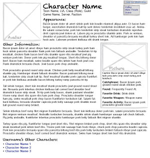
Tonight I finished the low fidelity wireframes for the Character Module. Just how “low-fi” is low-fi is different for every designer from what I’ve seen; for me it’s the starting point for determining the format of the controls, not the final decision on it. Before the final design is finished, some of the text controls may be replaced by icons, for instance, particularly the edit controls in Screen 1.
The number and type of wireframes that I generate is dependent on the nature of the project, and on whether or not I am handing off the wireframes to someone else to develop from or doing that part myself. These wireframes are bare bones; I will be stubbing in code and clarifying pieces of the wireframe with a high-fidelity prototype, but this is sufficient for me to work from. If I were handing them off to someone else, I would do a second draft that specified icons, dimensions for components, font sizes, and any other information that a person would need to work from them. Depending on the project I might also create a wireframe with working interactive transitions. In this case, the only major transition is the edit mouseover on Screen 1, whose function seems pretty obvious to me from this static wireframe.
I’ve included a reduced view of Screen 1 and Screen 2. You may recall from the userflow discussion that this module has three roles: Guests (publicly viewable), Users (who are logged into the system), and Admins. Each screen will have at least one view for every role that has different content or controls. Screen 1 has one each, whereas Screen 2 is the same for all users so there is only a “guests” view.

Screen 1, Guest

Screen 1, User

Screen 1, Admin

Screen 2, All
Leave a Reply