Logo and Web Design
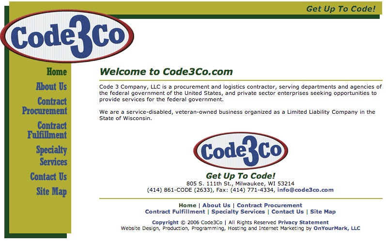
Code3co.com
Logo
As a service company, I opted to pursue a “mechanics patch” theme with the logo.
Animated Banner Ads For Code3Co
I used traditional (some would say “old-fashioned”) frame-by-frame animation to create these banners, in Photoshop and ImageReady, rather than relying on ‘tweening or simple program-created fades and slides. That gave me a lot of freedom with how the individual elements of the ad interacted with each other.
When I created these, I didn’t intend them to be a display of different types of cartoon physics. Nonetheless, they each typify a different aspect of animation that is a pitfall for many new animators, and that can cause your viewers to feel uneasy looking at your animation if you aren’t careful.

Object Resistance: Watch the logo as the slogan moves left in the banner above. For three frames, the logo compresses and then releases. This slight compression tells the viewer that these two elements are on the same plane, next to each other, that one is pushing the other. You have to spell out this kind of contact in your animations if you want to avoid a feeling of unconnected elements randomly floating in space. Viewers can tell instinctually when an object behaves in a way they’re not expecting even if they can’t pinpoint what exactly is wrong with it.
 Bouncing: The number one unconscious expectation of a bounce is bounceback. The element needs to overshoot its original position. Watch the logo to the left. See how it goes up a few pixels above its original position, with compression, and then comes back down? Most objects in real space have this characteristic. If you leave it out, your object will look like it’s somehow connected to the space it bounced into (in this case, the bottom of the ad).
 Spinning: I could write a book on spinning graphics and what to watch out for if you are using them.I’ll just list a couple things here. First off, remember that your element has a back. When the object spins, you should not see two copies of the front or you will break the 3D illusion. You can remedy this quickly by flipping the element and performing the same steps as you did with the unflipped element to account for the back. Second, lighting. If you are using a 3D program to create your spinning element, you don’t need to worry about this if you set the light source, but all flat animations require you to pay strict attention to propagating your light sources.


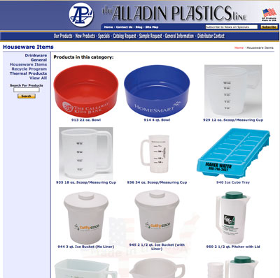 Display products and specs from our print catalog online
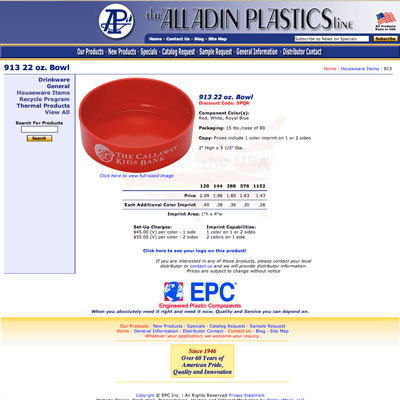 To make this possible I built them a content management system from the ground up in php, tailored to the information that each product required. There’s also a section where they can maintain other information, such as the shipping and ordering pages, and upload the new covers for the font page.