My husband Tony is a budding new designer, and we’ve recently instituted “Photoshop Challenge Days” between us. It’s a great way to practice our skills and do something fun together at the same time.
Monday’s challenge was “Pick a movie poster and do portraits in that style.” We both play Star Wars: The Old Republic so we decided to use our characters (and those of our guildmates) as subjects of the challenge.
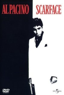
We both (independently) chose Mafia movies. What can I say? It’s appropriate to the characters. He picked The Godfather (you can see his challenge work here); I went with first Goodfellas and then, since that’s actually an ensemble poster rather than individual, Scarface:

For Goodsistas, I had to depart a bit from the style of the movie poster. For one thing, Qora (the Twi’lek) doesn’t even have hair to fade into the background, and none of them have black hair that can easily blend. The original poster is built around black, red and flesh, but obviously that’s a poor match for Qora’s skin. So I switched to black, blue and purple as my main color scheme. An even bigger challenge, however, was the eyes. These models have their eyes statically facing forward, so the original shots of the two in the back were looking off to the side and out of the poster. In order to sell the shot though, I absolutely needed the characters to be staring at the viewer. In the end, the poster is recognizably derivative of the original, but it has its own style that I was very pleased with.

Originals:


Leave a Reply