Just a quick update to show yesterday’s progress on plotting the subdivided lines:

Just a quick update to show yesterday’s progress on plotting the subdivided lines:

There was a sense early on that we wanted to go in a direction that was fun and a little over the top (ok, maybe a lot over the top) to match the personalities of the principal artists. A brainstorming session brought forward elements culled from comic books, traditional cel animation, old kung fu movies, sci-fi and, above all, laughter.
Long before settling on a name, we verbally sketched out a mascot that encapsulated the principles we wanted to portray. Mixing sci-fi and “drunken master” themed kung fu movies, we hit on a gi-wearing, beer-and-whiskey-drinking gray alien (shown to the left is a version drawn by one of the artists at the studio).
This over-the-top, tongue-in-cheek attitude carries through the rest of the studio, showing up in strange ways, like position titles, which include “Super Villain” and “The Fixer.”
I knew the logo needed to match this approach. A simple, graceful, corporate emblem would be at odds with the studio’s identity. The logo needed fluidity, panache, and a dash of craziness. I chose a font that was reminiscent of those old movies and manipulated the letters to make them flow into each other in a wobbly stagger.

The website follows the same theme. Everything has a thick cel-shading outline/flat color aesthetic, and I kept the shapes irregular:
Mascot illustration drawn by Anthony Pileri
Got about half the subdivided lines done today for plotting out:
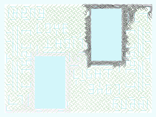
Knotwork is a “state of mind” sort of art for me, so it’s not uncommon to have two or three quite different works going at the same time. I’m not feeling the “Love and Light” today so I started a new circular knot (it might end up a triskele but I’m not sure of that yet).
For a square knot (or a rectangle based on squares), I can usually skip building the underlying grid because Photoshop has a grid-structure overlay, but there’s no such thing for grids based on circles.
I usually go for “photo blue” for grid lines in these pieces because of my background in traditional print. This shade of blue is not visible to the cameras that are used to make film for press plates, so back in the day the grids on the paper we used to layout pages, and the pencils we used to make notations, were this shade of blue. It’s stuck with me as connoting “grid I will build on.”
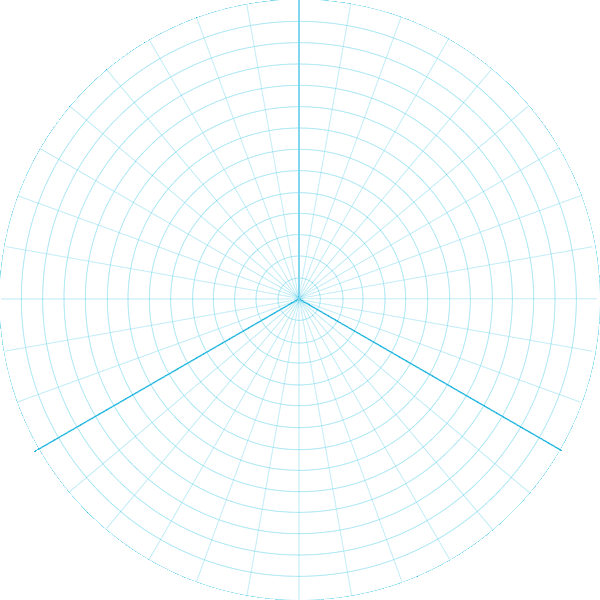
With subdivided threads marked.

