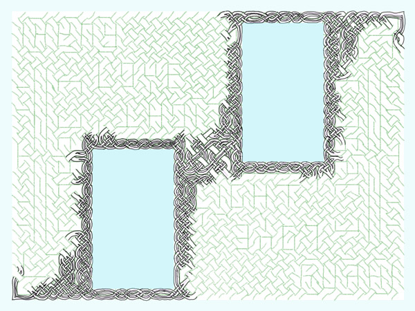
Here’s a preview of how the knotwork will look, as I have it in my head now. Subject to change, of course:
With guides:
and without:
full-size detail:
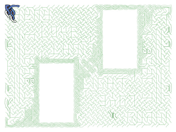
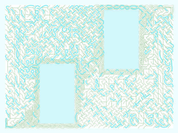
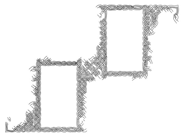
Here’s a preview of how the knotwork will look, as I have it in my head now. Subject to change, of course:
With guides:
and without:
full-size detail:
The final step of preparation is making sure that it’s one line. Sometimes I skip this or intentionally use multiple ribbons, but given the theme of this piece I thought it most appropriate to adhere to the tradition of the single unbroken line.
I start in a corner and on its own layer, draw along the ribbon to see just how much of of it is already in the first ribbon:
There’s still a pretty substantial part open and the knot is rotationally symmetrical at this point so I consider two different colored ribbons instead of one. After all, that’s still in keeping with the theme of “Love.” So I start at the next corner to see what falls into the second ribbon: Continue reading
Finished working out the subdivided lines:
The next step then is to start inking in the final knot lines themselves. I think I will stick with my usual hand-drawn approach to the lines instead of creating vector lines. I think it lends a different character to the piece. If I do that, I can use this subdivision working layer to start from, and just clean up some of the overlaps and joints on what I’ve already done.
 Userflows are the foundation from which the interface takes its form. All later parts of the project hang upon them. So what are they?
The userflow is a map of how the user interacts with the system, and how the system responds. The userflow will define what actions can or cannot be taken within the system, what happens when there’s an error, and how different types of users (for instance, this project uses Guests who aren’t logged in, Users who are logged in as registered users of the forum, and Admins, who belong to the admin group) navigate differently through the system. Note that a userflow will delineate what controls are needed but does NOT specify the form they take 99% of the time. Choosing the format of the control comes later, as part of the interface design, once you look at all the controls that are needed and how you can present them without them getting in the way.
There are a number of super programs out there that you can use to create stunning userflows. I used to use InDesign for them because I was comfortable with it from my print background but Illustrator, Visio, OmniGraffle and probably twenty or thirty other programs all have great features that can streamline your work and give you a polished presentation.
But you know what? I like drawing them in Google Docs. Besides the fact that I can access them from wherever, on my laptop, my pc or my Mac with equal ease, and share them with whoever without having to make a zillion copies, I just find it really easy to work with. Plain single-color boxes and arrows that snap to the anchor points of the boxes so I can move the box without having to reflow if I need to? Yep, that’s all I need. There’s something to be said for having a snazzy presentation for a client, and I get the arguments in favor of “sketchy” styles. I’m not knocking either approach. Personally though, I prefer to keep my flows as bare and simple as I can because when I start focusing on how to make them trendy, I’m diverting attention from making them function.
Flows available after the jump. Continue reading
Ghorfa was a guild of people playing Sand People from Tatooine. Yes, those Sand People. They would show up in places there shouldn’t be Sand People and get bystanders involved (think, flash mob of Sand People…).
This website was built around the invision forum system, which has an interesting dichotomy — you can’t change the files directly, but you can replace every image in the default templates and insert javascript into the base that would appear on every page. So really, if you are clever about it, you have nearly total control over the site, but you have to work around what’s already there without changing it.
That’s my favorite, because it forces me to think through new ways of doing things that I might otherwise take for granted.
Of all the game sites I’ve done, I think this one might be the most visually fun. I ran around for about an hour on Tatooine to get screenshots, and then pulled elements out of them to make all of the icons, the background, the buttons, the colors.
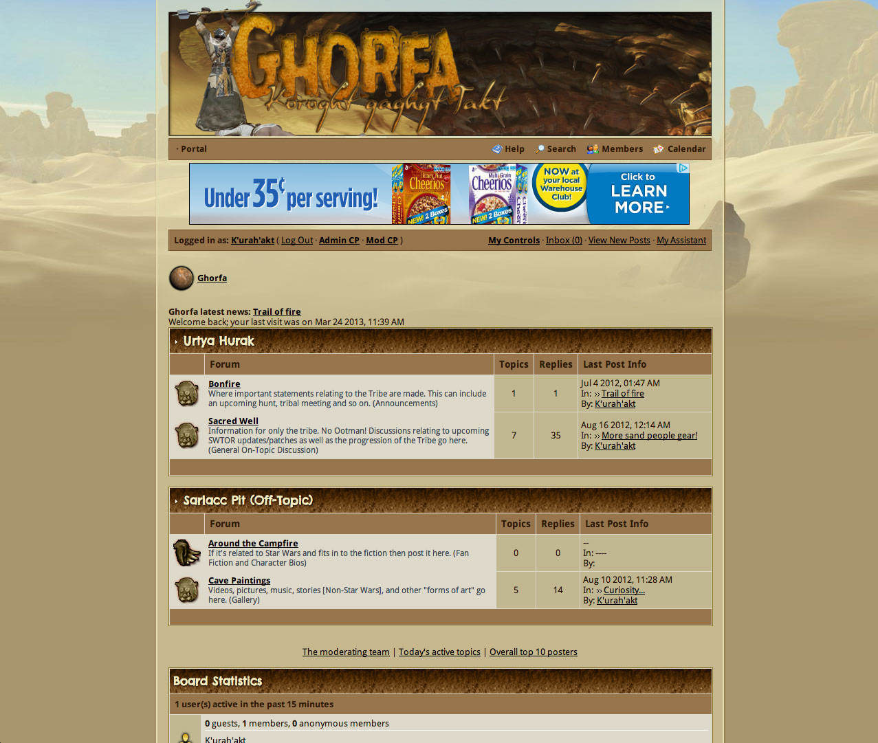
Alongside the visual elements, I picked up the language that was considered “canon” and expanded on it as we went, giving the Sand People an actual language to communicate in that others couldn’t follow unless they learned it from us as we went.
Koroght Uli-akhu, Ootman!